Overview
In the early 1900s, Sergei Mikhailovich Prokudin-Gorskii photographed scenes using red, green, and blue glass filters, with the intent of them being projected and combined to create color images in “multimedia” classrooms all across Russia. While his plan never materialized, his negatives are available to the public both physically and digitally through the Library of Congress. The data we are using is a set of three film exposures:
The obvious solution is to split up the image into three parts and directly overlay the images. However, this is not feasible in this context. Because the images were taken in succession, rather than all at once, there may be slight differences in the scene; this may include but is not limited to slight shifts in scene perspective / angle, or movement of objects in the scene. So, the R, G, and B, channels would not all match up, and the image would either look blurry or miscolored and clearly offset. Therefore, it is necessary to intelligently align the images as per these specifications. In this project, I aim to use digitized versions of Prokudin-Gorskii’s RGB glass plate negatives to faithfully reconstruct a RGB colored image, allowing us to take a peek into life in 20th century Russia.
Approach
The approach to reconstructing these images is twofold: first, I implemented an exhaustive approach which analyzed smaller images and aligned them; then, I implemented the image pyramid approach, which utilized the underlying logic of the exhaustive approach while using recursion and resolution changes to help speed up processing for larger images.
Part I: Exhaustive Search
The purpose of the exhaustive search is to check every possible shift of a given channel (within reason) and find the shift that gives that channel the best alignment with the base channel. In this case, the metric for “alignment” consists of finding the smallest SSD distance / L2 norm, which consists of sum(sum((image1-image2)^2)). So, to achieve this, I first split up the image into r, g, and b channels, which can easily be achieved by vertically splitting the image into three equal parts. Then, I iterated over a set of offsets — a “box,” of sorts — ranging from [-15, 15] in the x and y directions, checking the distance at every combination. This shifting starts at the middle of the image in order to avoid the edges / borders of the images, which introduce variability to the alignment. I updated the smallest distance and its corresponding offsets as I iterated over these combinations, so after executing the for loop, I had found the optimal x and y offset for the given channel. I did this for the r and g channels with them being aligned to the b channel, and finally stacked their color values on top of one another in order to construct an image in full color!
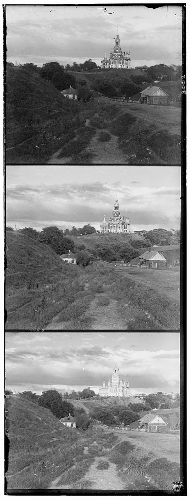
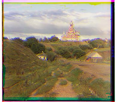
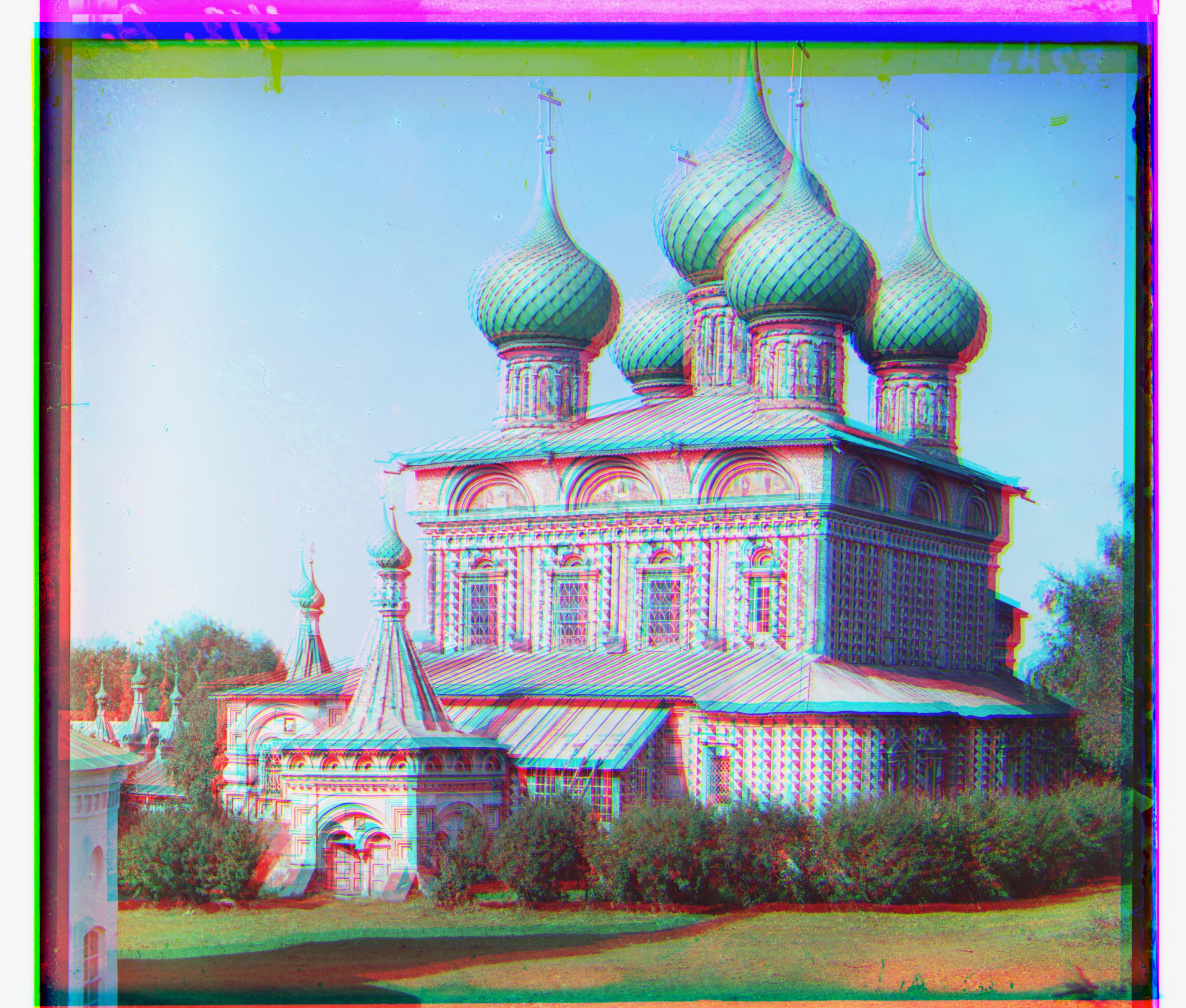
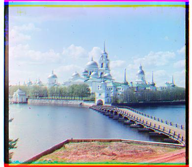
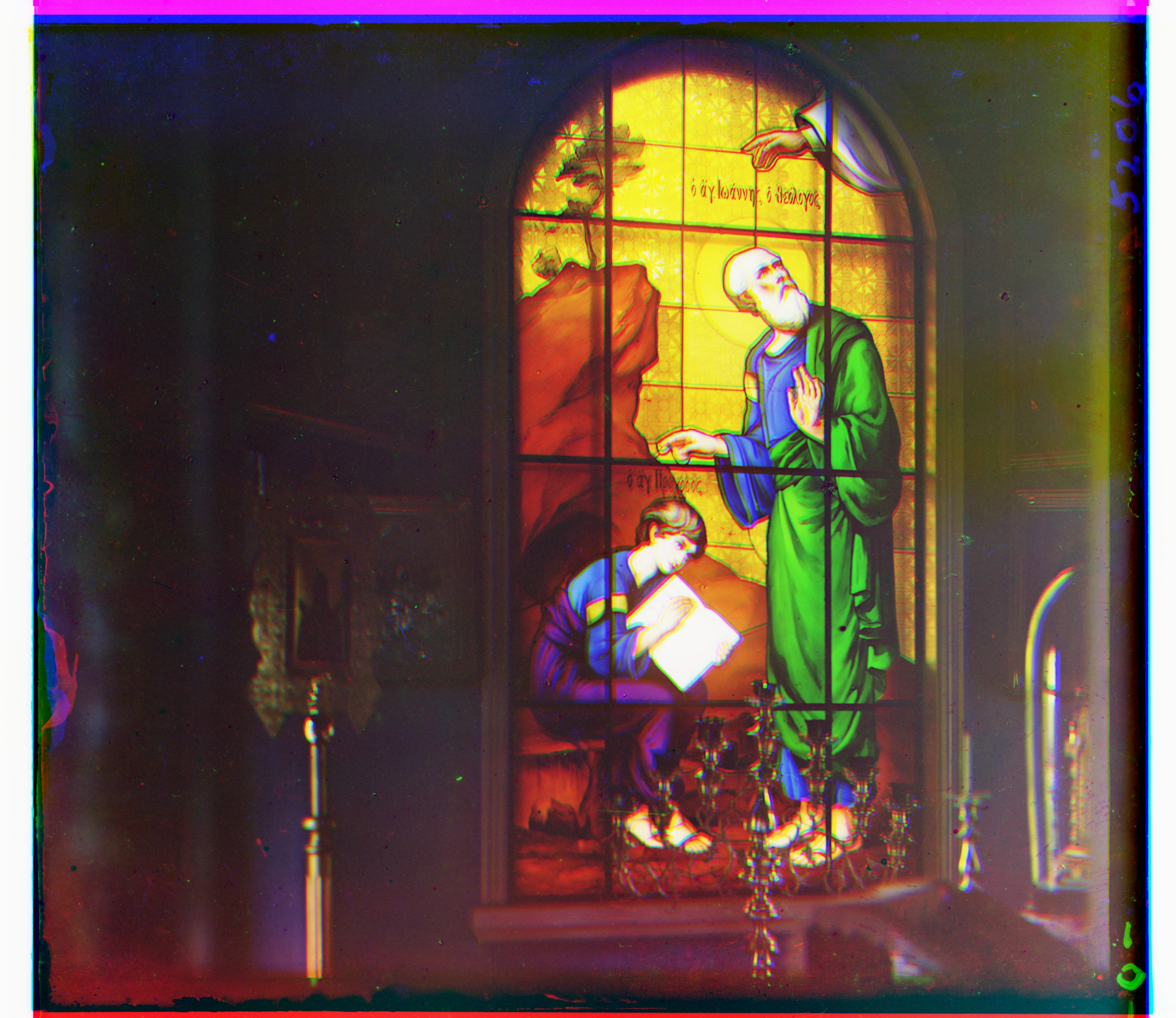
At this point, the smaller images were quite well aligned. However, I found that the monastery image, more so than others, was consistently blurry / misaligned. I was able to fix this in the second part of the project, but it was an interesting output I wanted to note! It looked as follows:
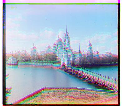
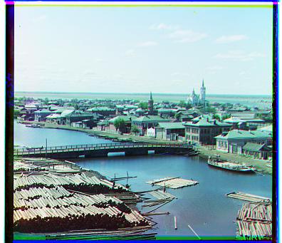
While the cathedral, on the other hand, looked a lot less blurrys:
Part II: Image Pyramid
However, for larger image (such as those found in tiff files), this cannot be done in a reasonable amount of time, so some optimization techniques must be utilized to speed up the process. For this project, I used the concept of image pyramids. Image pyramids are similar to the computer graphics concept of mipmapping, in which images are scaled in resolution (with a scaling factor of 2) in order to save computer storage and processing power. In this case, it’s being used to speed up computation. At a high level, this approach is also quite similar to Newton’s method, which is a process by which you create some larger “generalization” for the value you’re seeking, and then slowly refine that value until you reach the optimal value you’re searching for. In this case, we are refining our offsets, or amount we are shifting our channels by, in order to create an image that is crisp, clear, and properly matched. The general flow for implementing the image pyramid is as follows:
First, I set the scale factor. In this case, the scale factor is 2! Then, I checked if the image is greater than 350 by 350 pixels. If not, then simply run the exhaustive approach because it is more accurate and uses relatively similar computational power. If the image is greater than 350 by 350 pixels, the I run the image pyramid approach. In this approach, I recurse down the channels, decreasing the scale factor by two at every layer until you hit a point at which the resolution is less than 500 by 500. Once hitting that resolution, calculate an offset using the exhaustive approach. This is more efficient because there are less pixels to iterate over (it is a lower resolution). So, while this will not yield a perfect offset, it will give a good general ballpark offset. Then, after the first offset has been calculated, I moved down a layer in the pyramid, shifted the channels by their respective offsets from the previous layer, and recomputed the offsets for the current (2x higher resolution) layer. To compute the full offset for that layer, I first took the offset from the previous layer and multiplied it by the scale factor, 2. This is because the offset in the lower resolution is equivalent to 2 times the offset in the higher resolution image. So, taking this converted offset and adding the newly computed offset, we get the offset for that layer. By computing the offset in this way for every layer, we are able to “fine tune” the offset such that we move closer and closer to the true offset of the red and green channels. This greatly reduces the computation necessary — the bulk of the computation being in the top, low resolution layer — while also being able to make fine offset shifts while the resolution increases as we go down the image pyramid. This is how I achieved the coarse (low resolution) to fine (high resolution) speedup!
NOTE: the offsets here are represented as an array with two integers, where the first value is the x offset and the second value is the y offset for the given channel
 |
 |
|
|
 |
 |
 |
|
|
 |
 |
 |
 |
 |
 |
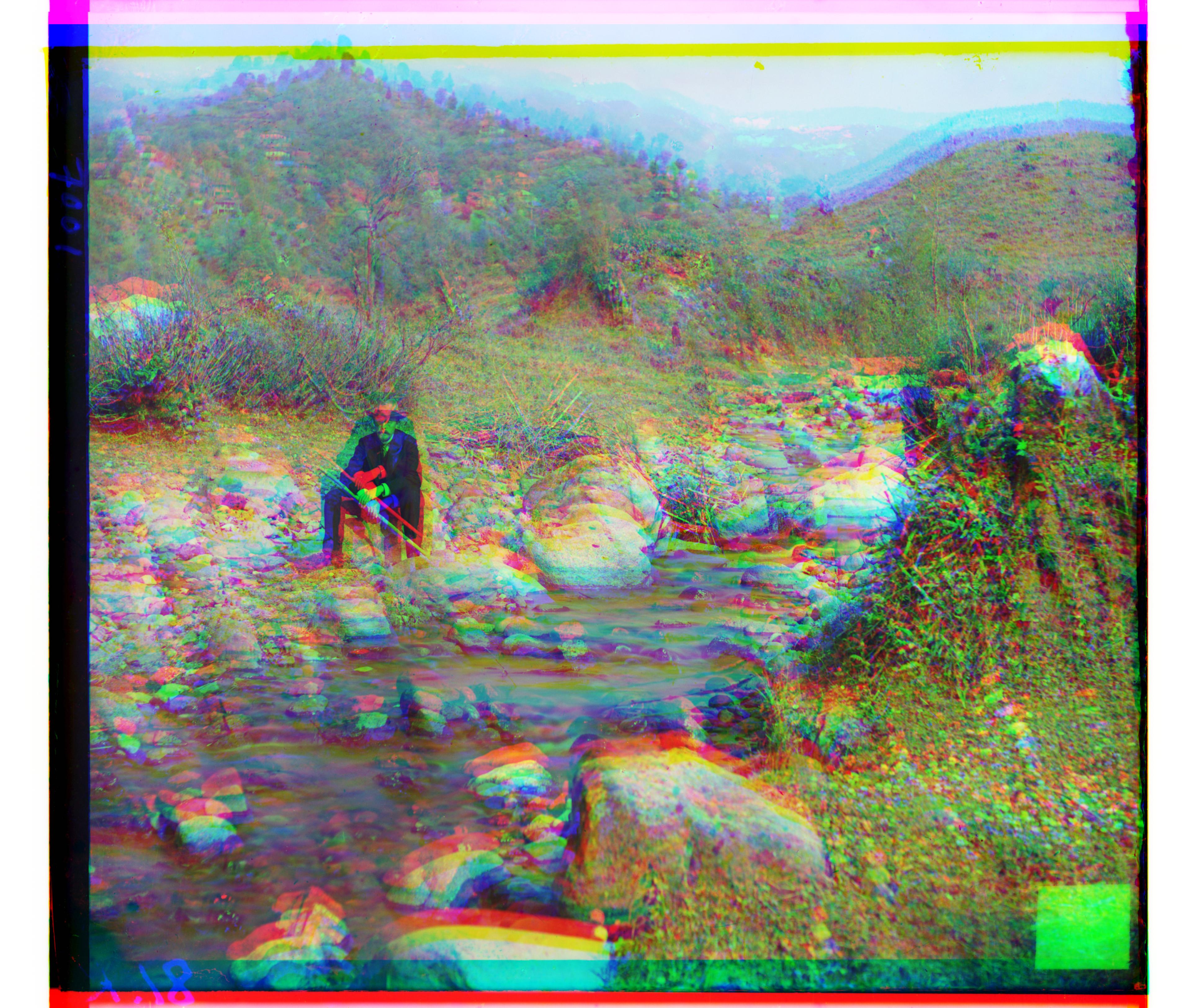 |
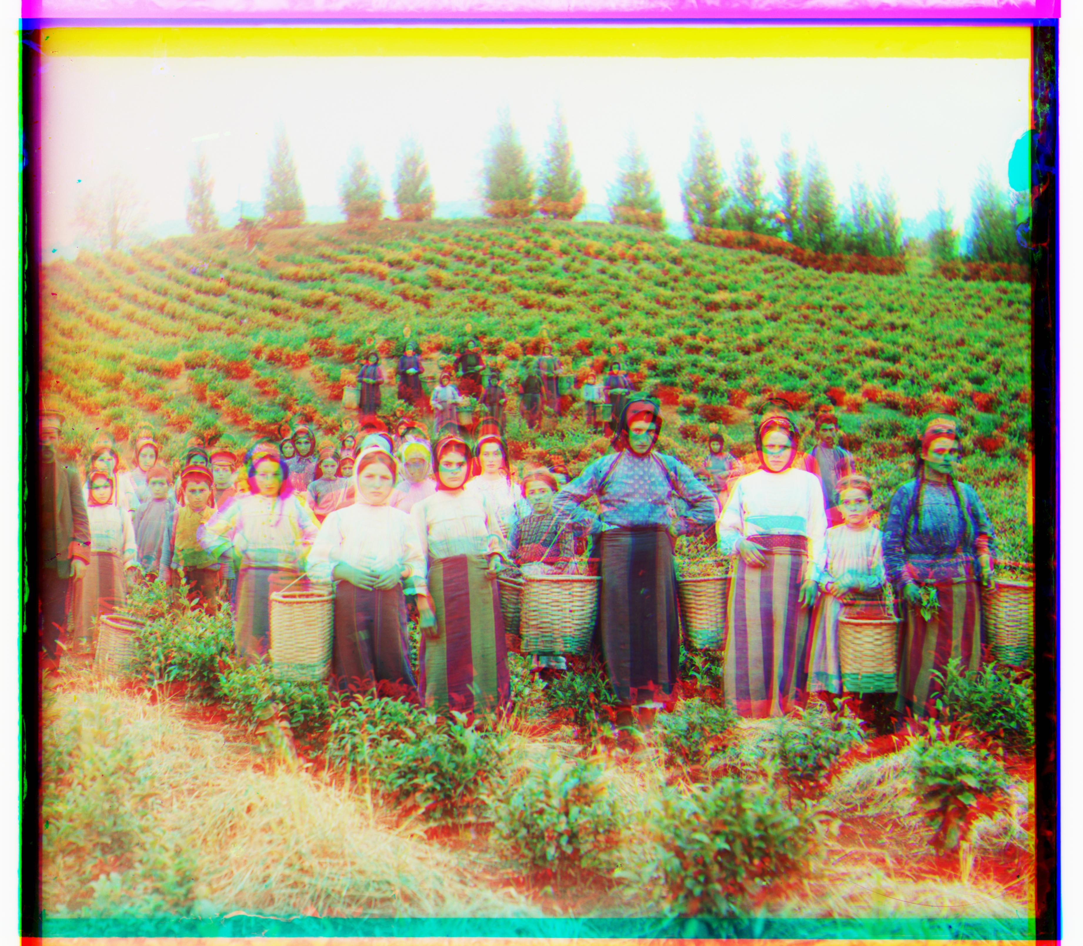
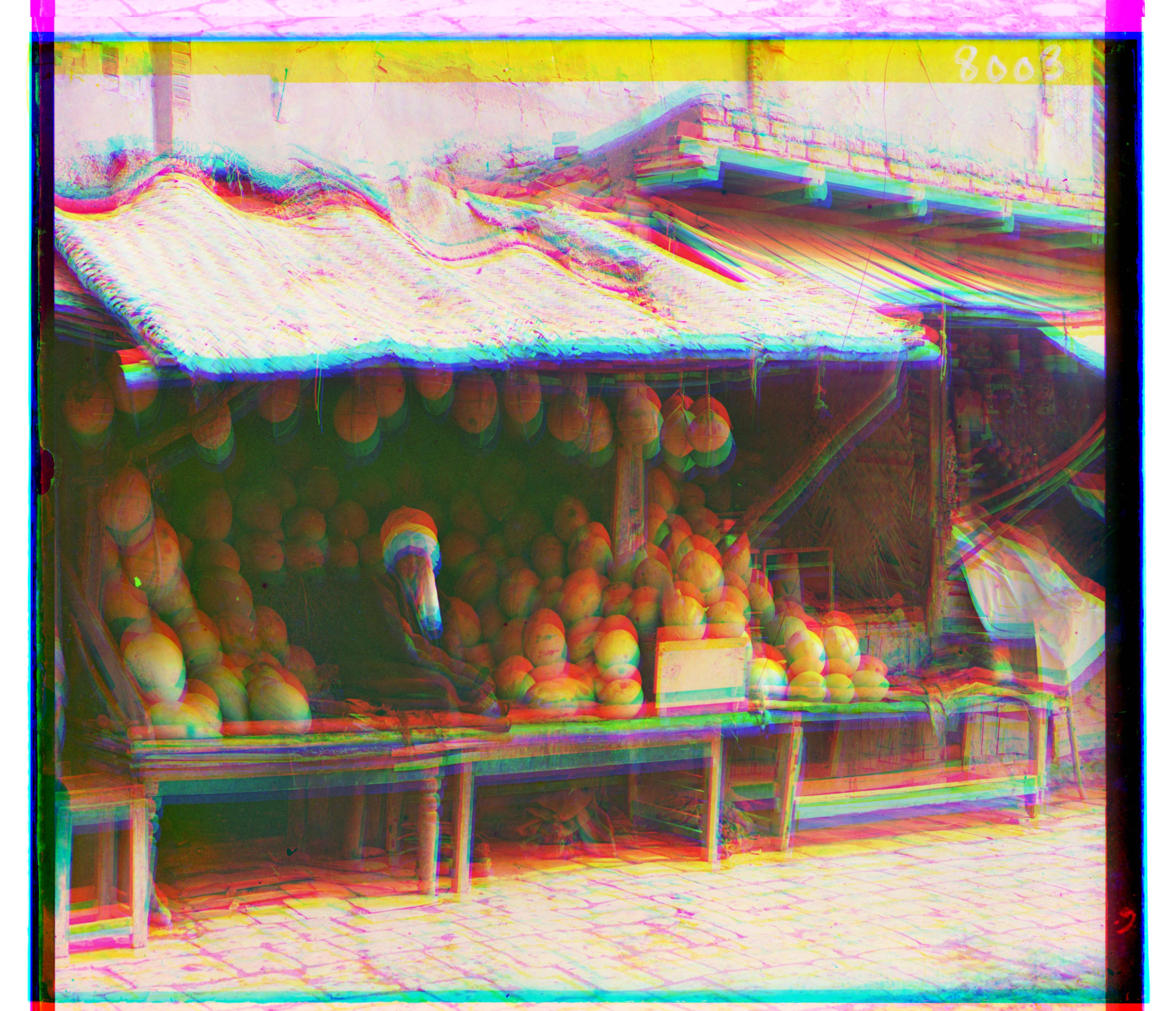
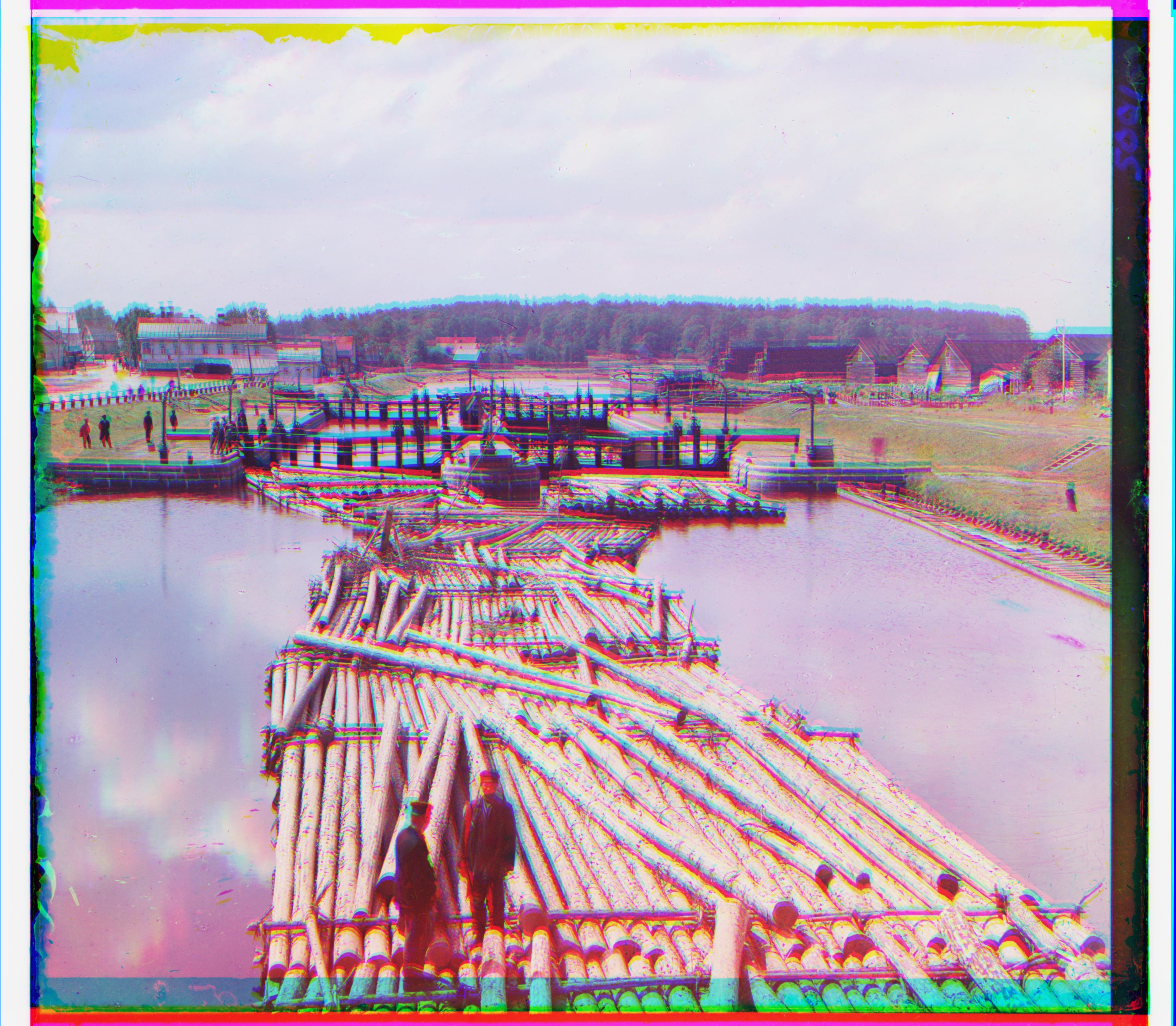
As can be seen, the images are not perfectly clear. In particular, the harvesters, melons, and self portrait images are slightly misaligned. This may be for a few reasons: brightness, movement, slight differences in camera orientation, and uneven borders. Brightness can largely affect images because my distance metric, SSD, is comparing raw pixel values. This is very much dependent on relative brightness and this variance can largely contribute to the misalignment seen in my results.

This may also be due to movement. For the harvester image, alongside brightness, there is a lot of misalignment found in very specific regions. Looking more closely, the woman in white who is on the left is fairly clear. Others, like the woman in blue, are off center. This could be for two reasons: either object movement in the scene, or changes in camera orientation. For the former, certain objects in the scene would be misaligned or in different poses, while others would be perfectly aligned. For the latter option, difference in camera perspective, this would be apparent in sections of the image being misaligned, while some parts of the image are aligned. I believe this is a combination of these two factors. Looking the woman wearing white with her and on her hip, her arm and face are slightly blurry and misaligned. This is an indication of movement between the capture of the three slides. However, this is not the case for some of the other "harvesters." They seem to remain in the same pose for all three slides, and therefore are likely misaligned due to perspective shifts, potentially compounded with other factors.
Finally, one other reason for potential misalignments would be the uneven black borders surrounding all of the images. This can be seen in the melon slides linked above. These lead to inconsistency between the content of the images, and therefore also contribute to differences in distance and alignment. This can be soled by properly cropping the images!
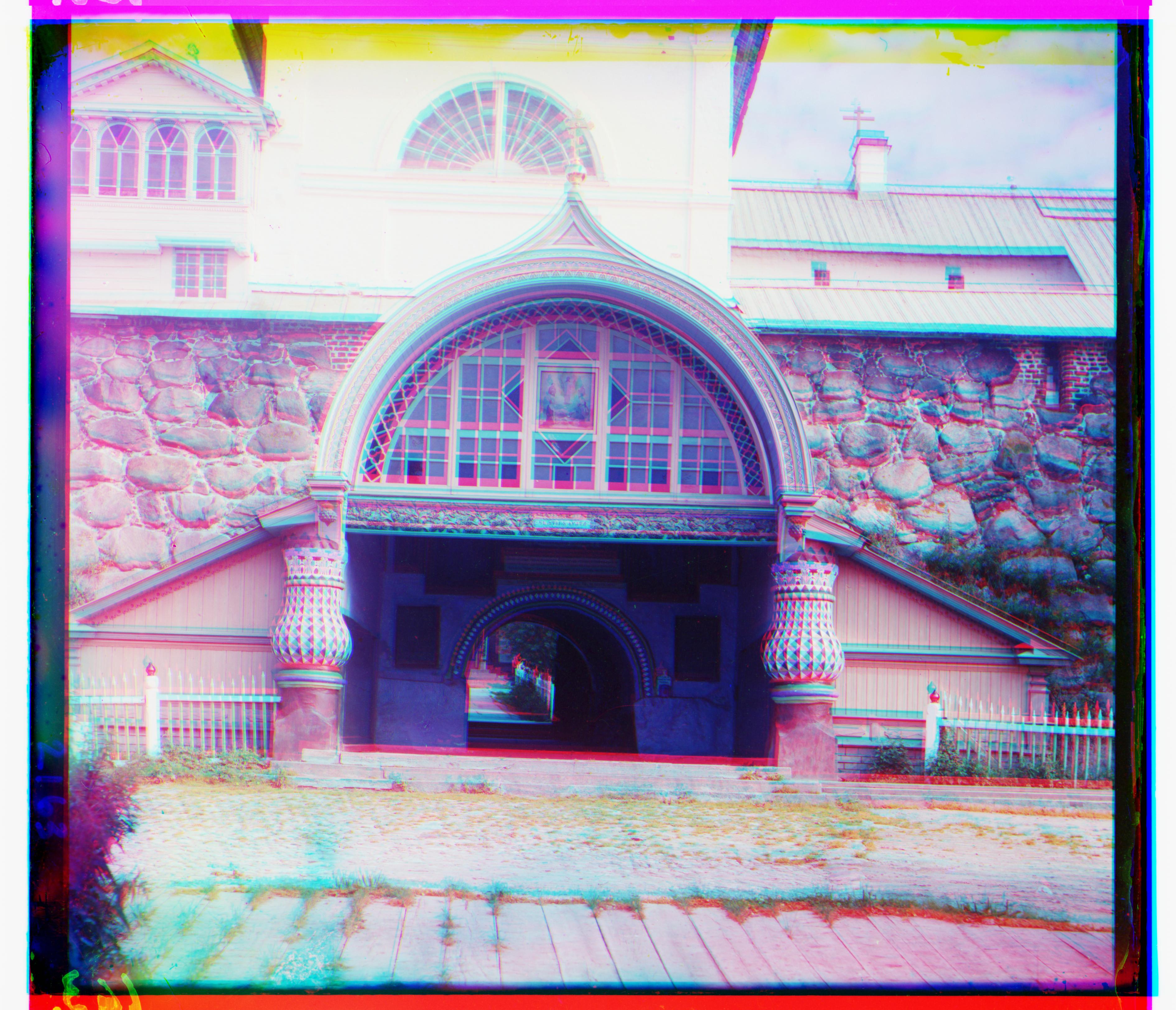
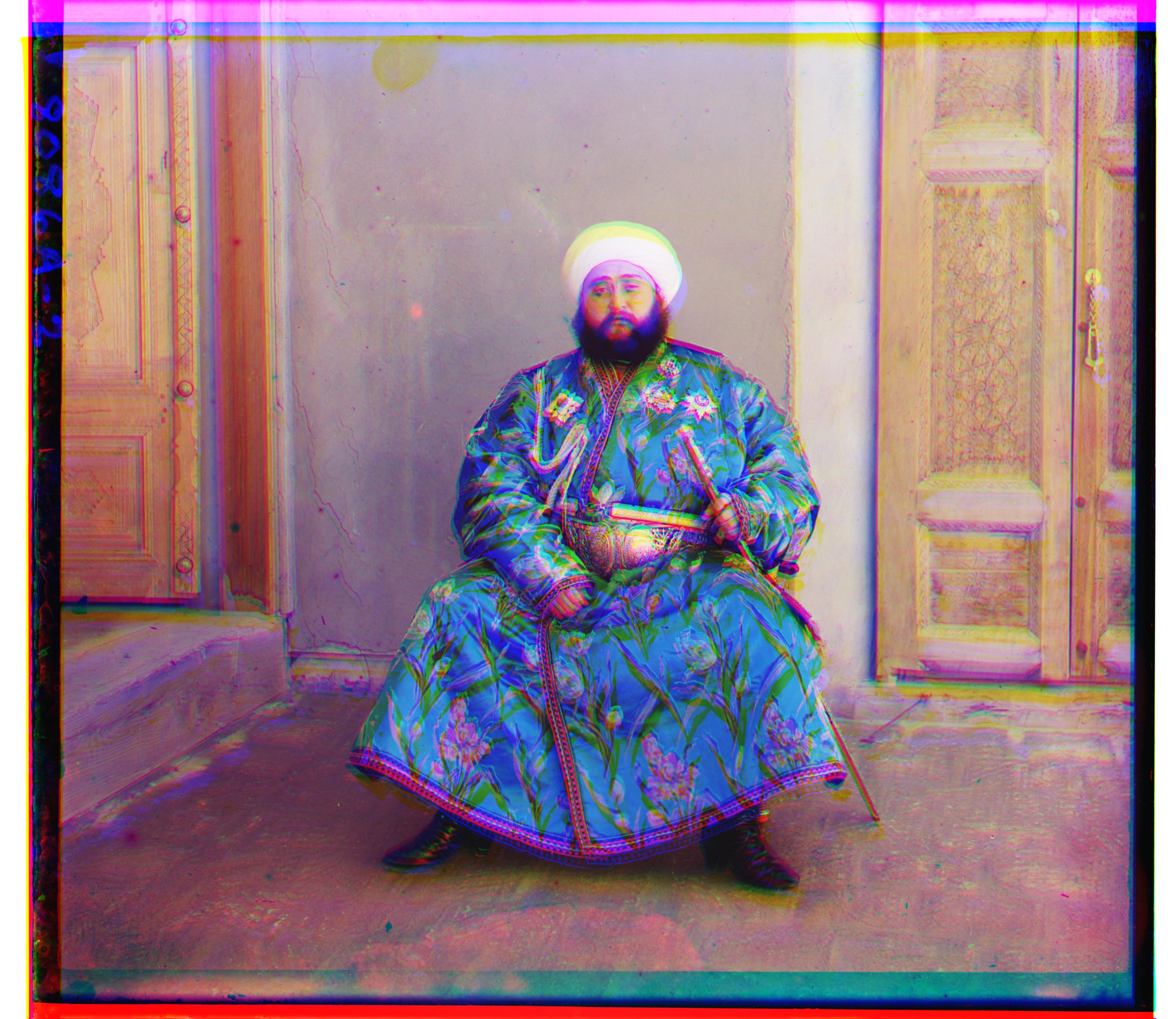
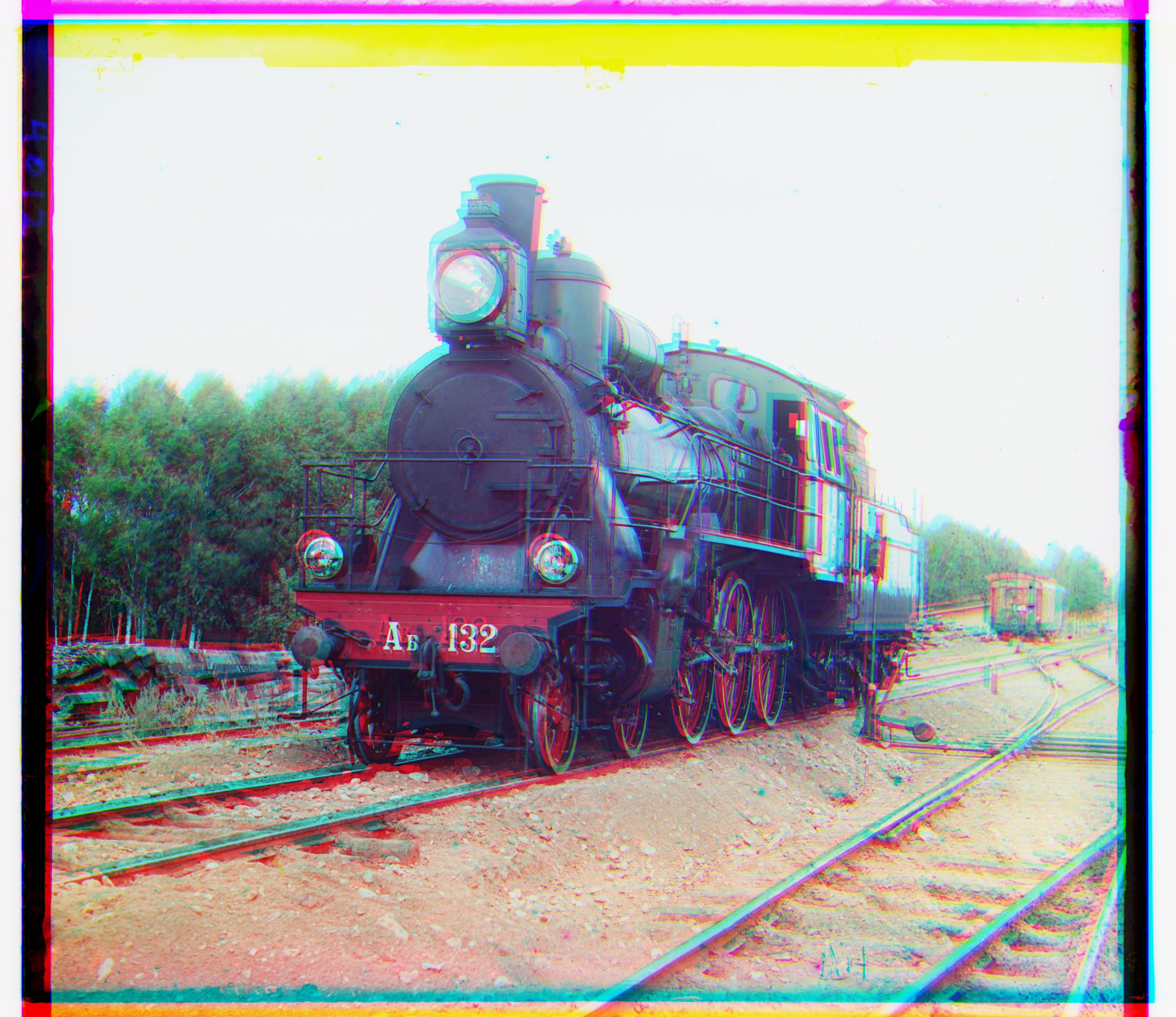
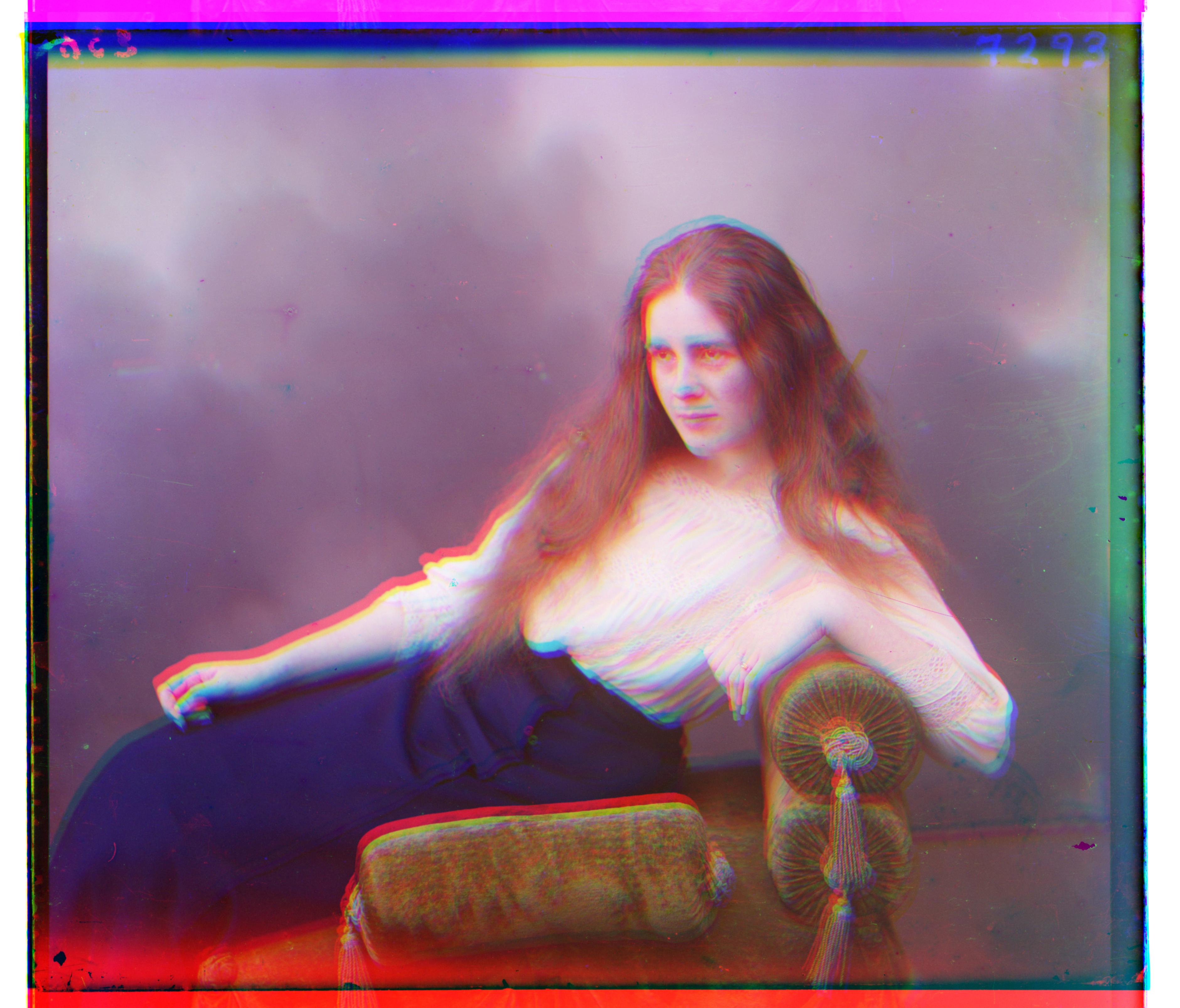
Custom images from Library of Congress:
 |
 |